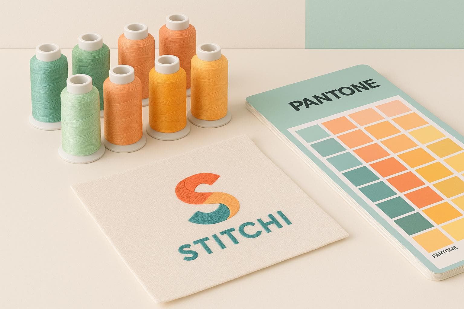
Thread Color Matching: Pantone vs. Thread Charts
When embroidering custom merchandise, color consistency is everything. A hoodie ordered in January must match caps purchased in June. This is where Pantone Matching System (PMS) and embroidery thread charts come in.
- Pantone is a universal color standard used across industries to ensure colors are consistent, no matter the medium. It’s perfect for branding and multi-material projects.
- Thread charts, specific to manufacturers like Madeira or Isacord, showcase actual thread colors. They reflect how threads will look when stitched but have limited color options compared to Pantone.
The best approach? Combine both. Start with Pantone for precision, then use thread charts to find the closest match. Test samples under proper lighting and consult embroidery professionals to avoid mismatches.
Quick Tip: Use Pantone for strict branding needs and thread charts for practical, fabric-based decisions.
Comparing Candle and Madiera Embroidery Thread Colors / Candle Embroidery Thread / Embroidery Haul
What is the Pantone Matching System (PMS)
The Pantone Matching System is a universal color standard used in design and manufacturing to ensure colors are replicated accurately across the globe. Each color is assigned a unique code, making it easy for designers, manufacturers, and suppliers to achieve consistent results, no matter the medium or location.
Introduced by Pantone Inc. in 1963, this system has become the go-to solution for reliable color management. For instance, "Pantone 186 C" will look the same whether it's printed on paper, displayed on a screen, or applied to fabric. This precision is why Pantone is the trusted choice for managing brand colors.
The system works by providing exact formulations for colors, which manufacturers replicate using standardized inks and dyes. By specifying a Pantone color, you eliminate guesswork and ensure consistency, reducing the risk of color mismatches between production runs or suppliers.
How Pantone Works
Pantone organizes its colors into collections, with the Pantone Matching System (PMS) being the most commonly used for commercial purposes. Each color is identified by a unique code, such as "Pantone 294 C" for a specific blue or "Pantone 7453 C" for a particular green.
The letter suffix in the code indicates the type of material or finish:
- "C" stands for coated paper
- "U" for uncoated paper
- "M" for matte finishes
These distinctions are crucial because the same ink can appear differently depending on the material's texture and how it absorbs ink.
Pantone provides fan decks and color books to serve as visual references under standard lighting conditions. Designers and manufacturers use these tools to match colors precisely, whether they're mixing inks, selecting fabric dyes, or choosing threads for embroidery.
The system includes both spot colors (solid, pre-mixed colors) and process colors (created by blending cyan, magenta, yellow, and black). Spot colors are particularly important for embroidery and custom merchandise, where solid-colored threads are used instead of blending multiple colors during stitching.
Benefits of Using Pantone
The biggest advantage of Pantone is consistency in branding. When a company specifies a color like Pantone 123 C for its signature yellow, that exact shade can be replicated on everything from business cards to promotional merchandise, creating a unified brand image that customers recognize and trust.
Pantone also removes the ambiguity from color descriptions. Instead of saying "bright red" or "navy blue", which can vary in interpretation, you can specify "Pantone 18-1664 TPX" or "Pantone 19-4052 TPX." This precision reduces errors in production and prevents costly mistakes like reprints or re-orders.
The system simplifies communication between global teams, manufacturers, and suppliers, streamlining production processes across borders. It also supports quality control by providing measurable standards. Tools like colorimeters and spectrophotometers can verify that the final product matches the specified Pantone shade, ensuring consistent results in large-scale production.
Pantone Use Cases in Custom Merchandise
Pantone is indispensable for logo reproduction on custom merchandise. Brands often define their colors using Pantone codes in their style guides. For example, when embroidering corporate logos on polo shirts, Pantone ensures the colors remain accurate across different fabrics and garment colors.
It’s also a game-changer for multi-material projects. Imagine a corporate event package with embroidered jackets, screen-printed tote bags, and branded pens. By specifying Pantone colors, you ensure all items match, even though they’re made using different materials and processes.
For seasonal merchandise campaigns, Pantone helps maintain consistency across multiple production runs. For example, holiday promotional items produced in September will match perfectly with additional inventory made in November, thanks to Pantone’s standardized color codes.
Corporate gifting programs also benefit from Pantone’s precision. Whether it’s executive gifts, employee recognition items, or client appreciation packages, using Pantone ensures that all branded items align with the company’s exact colors, reinforcing its professional image.
Franchise operations rely heavily on Pantone for maintaining brand consistency across locations. With Pantone specifications, regional suppliers can produce identical merchandise, no matter where they’re located, ensuring a cohesive brand presence worldwide.
Next, we’ll dive into how embroidery thread charts compare to the Pantone system for achieving accurate color matches in thread-based applications.
What are Embroidery Thread Charts
Embroidery thread charts are like color libraries designed by thread manufacturers to showcase their available thread colors for embroidery projects. Unlike the universal Pantone color system, these charts are manufacturer-specific, displaying the exact thread shades you can purchase and use.
Each manufacturer typically assigns unique codes or numbers to their thread colors. These charts often include physical samples - arranged on cards or in books - showing not just the colors but also details like thread sheen, texture, and weight. They may also provide fiber content and care instructions. Essentially, embroidery thread charts help bridge the gap between creative ideas and the final embroidered product, making it easier to choose and match colors while managing inventory effectively.
How Thread Charts Work
Thread charts organize colors into families, assigning each shade its own unique code. For instance, a rayon thread chart might display blues arranged from light to dark, with each shade labeled by a specific code. What makes these charts especially useful is that they often show the threads in their embroidered form rather than just as spools. This is important because the way a thread looks stitched - especially on darker fabrics - can be quite different from how it appears wound on a spool. To ensure accuracy, many charts include stitched samples photographed under consistent lighting.
Professional embroidery shops often keep charts from multiple manufacturers. This gives them access to a broader range of colors and makes it easier to match specific hues requested by clients. While digital versions of these charts are becoming more common, allowing designers to cross-reference colors on a screen, physical charts remain crucial for final decisions. Digital displays can vary, so physical samples are still the gold standard for accurate color approval.
Thread Chart Limitations
Thread charts come with a few challenges. For starters, their color selection is limited compared to Pantone's extensive range. This means finding an exact Pantone match is often impossible, and embroiderers may need to settle for the closest available shade.
Differences between manufacturers can also create complications. A perfect shade in one chart might not exist in another. Lighting conditions further add to the challenge - a color might look one way under fluorescent lights but appear entirely different in natural daylight or under LEDs. These variations can impact how the final embroidery looks.
Another factor is how threads interact with different fabrics. The same thread can look vastly different on a white cotton background versus a dark polyester one. Since most charts display samples on neutral backgrounds, they may not fully predict how a thread will appear on the actual fabric being used.
Pantone to Thread Code Conversion Tools
To help overcome these challenges, conversion tools have been developed. These tools provide approximate matches by translating Pantone colors into corresponding thread codes, simplifying the color selection process.
For example, some conversion charts cross-reference popular Pantone colors with equivalent thread shades across various fiber types. While these matches are approximate, they offer a helpful starting point. Digital tools go a step further by allowing users to cross-reference Pantone colors with thread codes and check availability.
Some embroidery shops also use advanced color-matching software. These programs analyze Pantone specifications and suggest thread combinations based on available inventory and fabric requirements. However, even with these technological advancements, physical samples viewed under proper lighting conditions remain essential for final approval. These tools and techniques help align standardized Pantone colors with manufacturer-specific threads, improving accuracy in custom embroidery projects.
Pantone vs Thread Charts Comparison
When it comes to embroidery, understanding the differences between Pantone and thread charts is crucial. These two systems serve distinct purposes, and comparing them side by side reveals how they influence embroidery outcomes.
Side-by-Side Comparison
Here's a closer look at how Pantone and thread charts differ:
| Factor | Pantone Matching System | Embroidery Thread Charts |
|---|---|---|
| Color Range | Over 2,000 standardized colors | 200-800 colors per manufacturer |
| Standardization | Universal across industries | Manufacturer-specific codes |
| Precision | Provides exact, replicable colors | Offers approximate matches |
| Physical Availability | Reference system only | Actual threads available for purchase |
| Licensing | Requires licensing | Included with thread purchases |
| Industry Acceptance | Widely used for branding | Standard for embroidery |
| Fabric Interaction | Predictive on paper | Reflects real thread behavior |
| Lighting Consistency | Controlled viewing conditions | Varies by chart and location |
Pantone is ideal for brand consistency, offering precise color specifications that remain consistent across various materials and applications. For instance, specifying Pantone 286 C ensures that the same shade of blue appears uniformly on business cards, digital screens, and even painted walls.
Thread charts, on the other hand, excel in practicality. They provide a tangible reference for the threads you can purchase and show how those threads will look when embroidered. This eliminates much of the guesswork involved in translating colors from a standardized system to a physical product.
When to Use Each System
Each system has its strengths, and choosing the right one depends on your project needs.
- Use Pantone when strict brand consistency is essential. Corporate logos, branded merchandise, and uniforms often require adherence to specific Pantone colors to ensure the same look across all marketing materials. If a brand guide specifies Pantone, start with those colors and then find the closest thread matches.
- Use thread charts for projects where exact matches aren't critical. Personalized gifts, decorative embroidery, or other designs can benefit from selecting colors based on how they actually look on the final product rather than trying to match a standardized color.
For the best results, combine both systems. Many professional embroidery shops begin with Pantone specifications and then use thread charts to identify the closest available matches. This approach balances brand requirements with the realities of thread availability while managing client expectations effectively.
Common Color Matching Problems
Even with careful planning, challenges can arise when matching colors in embroidery.
- Thread material impacts appearance. Rayon threads, for example, tend to look more vibrant and glossy, while cotton threads have a matte finish. Polyester threads fall somewhere in between but can shift slightly under different lighting conditions. A Pantone 186 C red might look bright in rayon but dull in cotton.
- Fabric color changes perception. Dark fabrics can make threads appear more vibrant, while light fabrics may wash out certain colors. This can lead to noticeable mismatches, especially when trying to maintain Pantone accuracy across different garment colors.
- Production tolerances create variation. Even when using the same thread, slight differences in dye lots can result in color shifts between production runs. While these variations are usually minor, they can still affect brand-critical applications.
- Digital displays are unreliable. Colors on computer monitors or mobile screens often differ from physical thread colors. Relying on digital thread charts can be misleading, so always verify colors with physical samples.
sbb-itb-6f489d9
Best Practices for Thread Color Matching
Building on the earlier discussion of conversion methods and sample testing, these practices help ensure precise thread color matching. Getting the colors right is crucial for maintaining brand consistency across all custom merchandise.
Using Conversion Tools Effectively
When it comes to matching thread colors, physical thread charts are your best friend. Digital charts can be misleading due to display variations, so stick to physical samples for better accuracy. Also, cross-check multiple conversion charts, keeping in mind that thread materials matter - rayon often looks brighter than cotton, for example.
If you're using a conversion chart designed for cotton threads but plan to work with rayon, make slight adjustments to find the closest match. Thread construction plays a big role in how colors appear, so don’t skip this step.
Another tip? Keep track of what works. Create a personal database of thread codes that pair well with specific Pantone colors on different fabrics. This will save you a ton of time when tackling similar projects in the future.
Once you've narrowed down your options, it’s time to test them under the right lighting conditions.
Evaluating Samples Under Proper Lighting
Always test your thread samples under standardized lighting conditions. Colors can look wildly different depending on the light source - fluorescent, natural daylight, or LED lighting. To avoid surprises, simulate the environment where your product will be displayed.
A controlled light box is a great tool for this, as it mimics natural daylight. Stitch small test samples directly onto the fabric you’ll be using. Thread colors can shift depending on the background, so testing on the actual material ensures accuracy.
It’s also a good idea to check your thread samples at different times of the day. Natural light changes throughout the day, and ensuring your colors look good in various settings can save you headaches later.
Collaborating with Embroidery Professionals
After narrowing down your options with conversion tools and lighting tests, it’s time to bring in the experts. Work with embroidery professionals to lock in the perfect color match.
Clear communication is key here. Share your official Pantone specifications, brand guidelines, and examples of approved colors. This ensures everyone involved understands the expectations.
Before committing to a full production run, request physical thread samples or test patches. Seeing how the threads look on your chosen fabric helps confirm your decisions and avoids costly mistakes.
Also, discuss thread substitution policies early on. Thread availability and dye lots can vary, so having clear guidelines on acceptable substitutions will help maintain consistency and prevent unexpected issues.
For especially critical colors, consider custom thread dyeing. While it may require larger orders and more time, this option provides the most precise match for key brand elements.
Lastly, choose embroidery professionals who have a strong grasp of color theory. They can help refine adjacent colors and ensure your brand’s visual identity stays on point.
How Stitchi Handles Thread Color Matching
Stitchi has mastered the art of thread color matching to ensure brand consistency across custom embroidered products. Based in Detroit, this merchandise agency knows that accurate color reproduction is critical for maintaining a cohesive brand identity.
Combining Pantone and Thread Charts
To achieve precision in color matching, Stitchi uses both the Pantone Matching System and embroidery thread charts. The process begins with clients sharing their official Pantone color specifications from their brand guidelines. These specifications act as the baseline for all color decisions.
Next, the team turns to physical thread charts to match colors accurately. By using physical samples instead of relying on digital screens, they eliminate discrepancies caused by screen variations. They also ensure colors are checked under consistent lighting conditions. Stitchi takes into account how different materials, like rayon and cotton, affect the appearance of colors - rayon tends to look brighter, for example. This attention to detail ensures that the final thread colors align perfectly with the client’s brand.
To streamline future projects, Stitchi maintains a database of successful Pantone-to-thread conversions. This database allows for quick and accurate color replication, making it easier to handle repeat orders.
Custom Thread Color Matching
When standard thread charts don’t meet a project’s needs, Stitchi offers custom thread dyeing solutions. This service is ideal for unique brand colors or large-scale orders where absolute color precision is essential.
The custom dyeing process involves collaborating with thread manufacturers to create exact color matches. While this option requires larger minimum orders and longer lead times, it guarantees unmatched accuracy for key brand elements.
Stitchi’s platform also ensures consistency by centralizing custom color specifications. Once a color formulation is created, it’s stored in their system, making it simple to reproduce exact matches for future projects. This approach has been instrumental for clients like Morning Brew and Shinola Hotel, helping them maintain their distinct brand identities across a variety of custom merchandise, from event swag to corporate gifts.
Ensuring Quality Results
Stitchi goes the extra mile to deliver high-quality, on-brand merchandise. Before full production begins, the team tests samples on the actual fabrics that will be used. These samples are evaluated under various lighting conditions - fluorescent office lighting, natural daylight, and LED environments - to ensure color consistency in any setting. This meticulous testing process helps avoid unexpected issues and ensures the final products meet the client’s standards.
Stitchi’s merch experts work hand-in-hand with embroidery professionals who have a deep understanding of color theory. This collaboration allows for fine adjustments to ensure that all colors work harmoniously and that the end product has the desired visual impact.
To maintain transparency, clients can review and approve digital samples before production begins. This step ensures that timelines stay on track and that the final output meets expectations.
Final Thoughts
Deciding between Pantone and thread charts boils down to understanding their roles in the embroidery process. Pantone provides a reliable starting point for color selection, while thread charts deliver the tactile precision needed for physical projects. They allow you to see how colors, textures, and sheen interact under real-world lighting conditions, which is crucial for embroidery work [1].
The most effective approach often combines both systems. Begin with a Pantone reference to establish your color baseline, then use color-conversion tools to find the closest thread match. However, digital tools should only guide the process. For accurate results, physical thread charts remain indispensable. They give you a real-world perspective on how colors will look on fabric under various lighting conditions [2].
To ensure success, always verify digital matches with physical samples in natural light. This step helps you understand how colors truly behave and ensures the final product meets your expectations [2].
Collaborating with experienced professionals is another essential piece of the puzzle. Thread manufacturers frequently update their color ranges, and seasoned experts know how different thread materials and fabric types will interact. Their expertise ensures any necessary adjustments are made to maintain your brand’s visual integrity [2].
Stitchi exemplifies this balanced approach. By integrating Pantone references with physical thread evaluations and offering custom color solutions, they’ve helped major brands achieve consistent, high-quality results. Their process ensures repeatability, which is vital for maintaining brand consistency across projects and reorders.
Ultimately, achieving precise color reproduction in embroidery requires a mix of digital tools, hands-on techniques, and expert guidance. With the right strategy, you can create custom embroidery that not only aligns with your brand identity but also leaves a lasting impression.
FAQs
How can I make sure my embroidery thread colors match my brand's Pantone colors?
To get embroidery thread colors that align perfectly with your brand's Pantone shades, start with a physical Pantone swatch book. Compare the swatches directly with thread samples for the most accurate match. Many thread manufacturers also provide Pantone matching guides, which can help you pinpoint the closest thread color to your desired Pantone tone.
For consistent results, always compare colors under neutral, even lighting. This attention to detail ensures your custom merchandise represents your brand's identity exactly as intended.
What are the benefits of using both Pantone and embroidery thread charts for custom embroidery projects?
When working on custom embroidery projects, using both Pantone color guides and embroidery thread charts is a smart way to ensure accurate and consistent color matching. Pantone offers a standardized system that keeps colors uniform across digital and print designs, while thread charts translate those colors into the closest matching embroidery threads.
By pairing these tools, you can achieve precise color reproduction, reducing the chances of mismatched shades. This method is especially important for projects where maintaining exact color accuracy is essential, helping you create polished, professional-quality embroidered products.
How does lighting affect the way thread colors look in embroidery, and how can I ensure consistency?
Lighting significantly impacts how thread colors are perceived in embroidery. The same thread can look completely different depending on whether it's viewed in natural sunlight, fluorescent light, or incandescent light. For instance, a thread that seems vivid and lively in daylight might appear more subdued under indoor lighting.
To maintain consistency, it's a good idea to examine thread samples under various lighting conditions before making your final choice. This ensures the colors will align with your vision, regardless of the lighting in the environment where the finished piece will be displayed.