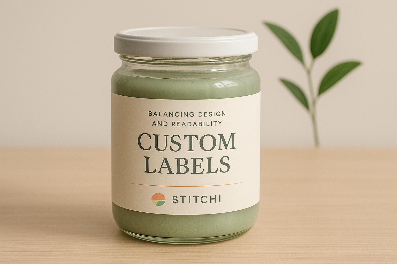
Custom Labels: Balancing Design and Readability
Creating effective custom labels requires balancing two priorities: capturing attention with visually appealing designs and ensuring readability for everyone, including those with visual impairments. Labels must communicate essential product details while reflecting a brand's identity, but leaning too heavily on style can compromise usability.
Key considerations include:
- Color Contrast: High contrast improves readability, while low contrast may hinder it.
- Typography: Simple, legible fonts work better than decorative styles.
- Layout: Clear, logical layouts make information easier to find.
- Standards Compliance: Meeting accessibility guidelines ensures inclusivity and legal compliance.
Two approaches are common:
- Design-First: Focuses on aesthetics but often sacrifices usability.
- Accessibility-First: Prioritizes readability and inclusivity but may lack visual flair.
Balancing these approaches involves thoughtful design choices, user testing, and adherence to accessibility standards like WCAG. This ensures labels are both functional and visually appealing, broadening their usability and impact.
Understanding WCAG SC 3.3.2 Labels or Instructions (Level A)
1. Design-Focused Label Approach
A design-focused approach puts visual aesthetics and brand identity at the forefront, treating labels as a canvas for creative expression.
Color Contrast
These labels often experiment with low-contrast color schemes to achieve an elegant, high-end appearance. For instance, luxury brands might use subtle gray-on-white combinations or gold foil against dark backgrounds. While these choices create a sophisticated look, they often sacrifice readability for style.
Gradient backgrounds and textured surfaces are also popular in this approach. Fashion brands, for example, might incorporate watercolor designs or metallic finishes to add depth, even if it slightly hampers legibility.
Color choices are deeply influenced by psychology, aiming to evoke specific feelings or associations. A wellness brand may opt for calming pastel tones, even if these colors don’t provide enough contrast for easy reading.
Typography and Font Legibility
Custom fonts, including decorative and script styles, are often used to give the label a distinct signature. However, this can come at the expense of readability. The goal is to make the label visually unique and instantly recognizable, even if it means some users might struggle to read it.
Font sizes tend to vary significantly. Brand names are typically displayed in large, bold text, while critical details like ingredients or care instructions are relegated to much smaller fonts. This prioritization of branding over functionality can pose challenges, particularly for individuals with visual impairments.
Decorative text effects, such as outlines, shadows, or text integrated into graphic elements, are common in this approach. While these techniques make the label visually striking, they can introduce visual clutter, making it harder to read the text clearly.
Label Layout and Placement
Design-focused labels often use asymmetrical layouts and unconventional text placements, like curved text or angles, to create visual intrigue. While these layouts can be eye-catching, they may disrupt natural reading patterns.
White space is used primarily for aesthetic purposes rather than functionality. For instance, space might be reserved to highlight brand imagery or achieve visual balance, often leaving critical text crammed into smaller, less noticeable areas.
Overlapping design elements are another hallmark of this approach. Text is frequently placed over complex backgrounds or competes with decorative graphics, creating a visually rich experience. However, this can make it harder for readers to quickly locate and absorb important information. These design choices highlight the challenges of balancing visual appeal with practical accessibility.
Compliance with Accessibility Standards
Balancing bold design with accessibility is tricky. In many cases, design-first labels treat accessibility as a secondary concern, focusing instead on visual impact.
WCAG guidelines are often overlooked to preserve the brand’s aesthetic. The reasoning is that altering the design to meet accessibility standards might weaken the brand’s visual identity and marketing effectiveness. This approach tends to treat accessibility as an afterthought rather than an integral part of the design process.
When accessibility is addressed, it’s usually done to meet the bare minimum legal requirements. Small tweaks might be made to comply with regulations, but these adjustments rarely disrupt the overall design vision. This approach prioritizes style over substance, setting the stage for how accessibility-focused strategies can offer a different perspective.
Next, we’ll explore how prioritizing accessibility reshapes these design choices.
2. Accessibility-Focused Label Approach
This method prioritizes accessibility at every stage of the design process, ensuring labels are readable and effective for all users. Unlike approaches that treat accessibility as an afterthought, this one weaves it into the core of every decision.
Color Contrast
Accessibility-focused labels rely on high-contrast color combinations that meet or exceed WCAG standards. Think black text on white backgrounds, white text on dark surfaces, or dark blue on light gray - these combinations make text easy to read under different lighting conditions and for users with varied visual abilities.
To keep things simple and clear, these labels avoid busy imagery and stick to solid backgrounds. Standardized colors, like red for danger or orange for caution, are paired with text or symbols to reinforce meaning. Importantly, color is never the sole indicator of critical information. Text or symbols always accompany colors, ensuring users with color blindness can still understand the message.
This attention to contrast lays the groundwork for equally thoughtful typography and layout choices.
Typography and Font Legibility
Typography plays a key role in readability. Sans-serif fonts like Arial or Helvetica are chosen for their clarity, even at smaller sizes. To prioritize critical information, font sizes follow a clear hierarchy: essential details are displayed in larger, bold text, while secondary information appears in slightly smaller but still readable sizes. A minimum font size of 12 points is maintained to ensure text remains legible without magnification.
Text effects, like shadows or decorative styles, are avoided to prevent blurring or confusion. The result? Clean, sharp text that’s easy to read at a glance.
Label Layout and Placement
The layout of these labels is straightforward, guiding the reader naturally from top to bottom and left to right. This logical flow helps users quickly find the information they need.
White space is used strategically to separate sections and make the label easier to read. Generous margins prevent the content from feeling cramped, reducing cognitive load and improving overall clarity.
A well-defined information hierarchy ensures the most important details stand out. Key information is placed prominently at the top in larger text, with supporting details following in a logical order. This structure allows users to scan the label efficiently without getting overwhelmed.
Compliance with Accessibility Standards
From the outset, WCAG guidelines are integrated into the design process, rather than being tacked on later. Labels are rigorously tested for contrast ratios, meeting AA or AAA standards depending on their intended use. This proactive approach ensures accessibility issues are addressed before they arise.
To further enhance accessibility, supplementary formats like QR codes for audio, Braille, or large-print versions are included without compromising the label's design.
Finally, testing with assistive technologies and input from diverse users ensures the design is practical and effective for everyone.
sbb-itb-6f489d9
Pros and Cons
Each approach brings its own set of strengths and challenges. Here's a side-by-side comparison to help illustrate the key differences:
| Criteria | Design-Focused Approach | Accessibility-Focused Approach |
|---|---|---|
| Visual Appeal | Pros: Eye-catching designs that stand out on shelves Cons: Aesthetic choices may compromise readability |
Pros: Clean and polished look Cons: May feel plain or less dynamic |
| Color Contrast | Pros: Bold, creative color choices enhance branding Cons: Poor contrast can hinder readability and fail WCAG standards |
Pros: High contrast ensures readability across conditions Cons: Limited palette might restrict creativity |
| Typography | Pros: Distinctive fonts create strong brand identity Cons: Decorative fonts may be hard to read, especially in smaller sizes |
Pros: Sans-serif fonts ensure clear readability Cons: Standard fonts might lack uniqueness or personality |
| Layout Flexibility | Pros: Creative layouts enhance storytelling and engagement Cons: Complex designs can obscure the hierarchy of information |
Pros: Clear structure ensures easy navigation Cons: Highly structured layouts might feel rigid or uninspired |
| Regulatory Compliance | Pros: Focuses on marketing impact Cons: Higher risk of non-compliance with accessibility laws |
Pros: Reduces legal risks by meeting accessibility standards Cons: Requires more testing and validation efforts |
| Target Audience | Pros: Appeals to specific niches or demographics Cons: May exclude individuals with disabilities or impairments |
Pros: Broadly inclusive, serving diverse audiences effectively Cons: Might not resonate as strongly with niche or trend-driven markets |
The design-focused approach thrives on creating bold, memorable designs that forge emotional connections with consumers. However, it often sacrifices usability, making it harder for some users - like those with visual impairments - to interact with the product effectively.
On the other hand, the accessibility-focused approach ensures inclusivity by prioritizing readability and usability for all, including those with disabilities. While this approach may lack the visual flair of a purely design-driven strategy, it builds trust and reflects a commitment to inclusivity and responsibility. The trade-off? It might not grab attention as quickly in competitive, visually-driven environments like retail shelves.
Up next, we’ll explore best practices for balancing impactful design with accessibility.
Best Practices for Balancing Design and Readability
Creating labels that are both eye-catching and easy to read requires a thoughtful approach that prioritizes user experience through careful planning, collaboration, and testing.
Start by focusing on accessibility as the cornerstone of your design. The four WCAG principles - perceivable, operable, understandable, and robust - should guide every decision[3]. This means your labels should be easy to see, interact with, and comprehend, while also functioning seamlessly across various devices and assistive technologies. These principles influence everything from layout to typography.
Typography is key to readability. Use fonts that are at least 16 points in size, and steer clear of overly decorative, italicized, or all-caps styles for critical information[5]. Simple, clean font choices ensure that users can easily process the text without unnecessary strain.
Color contrast is another crucial factor. For text, aim for a contrast ratio of at least 4.5:1, and for non-text elements, maintain a minimum ratio of 3:1[2]. Thoughtful color selection can enhance both the visual appeal of your labels and their legibility.
Collaboration is essential. Involve both design and accessibility experts early in the process to review label concepts. These reviews should happen at critical stages - like the initial concept, the first draft, and just before production - to catch and address potential issues before they become costly revisions[4].
User testing brings real-world insights. Automated tools are helpful, but they can miss practical challenges. Recruit participants who reflect your actual audience, including individuals with visual, cognitive, or motor impairments. Test your labels in realistic conditions, such as varying lighting, different distances, and with physical products, to uncover issues you might not have anticipated[1].
To streamline the process, leverage technology that supports both compliance and creativity. For example, Stitchi’s platform integrates design and accessibility standards, helping brands maintain consistent, compliant labeling while providing insights into what resonates with diverse audiences.
White space matters. Thoughtful spacing between text elements, clear margins, and uncluttered layouts not only improve readability but also create a more polished aesthetic. This approach works whether you're designing for luxury packaging or tech products.
For additional inclusivity, consider tactile elements and alternative formats. Features like raised text, Braille, or QR codes that link to audio descriptions can make your labels more accessible while adding a unique touch to your design[5].
Use data-driven insights to refine your designs. Metrics like QR code scans, customer feedback, and accessibility audit results can reveal how users interact with your labels. Testing under real-world conditions ensures your labels perform well and meet user needs.
Finally, establish clear guidelines and templates for your label designs. Document approved fonts, color palettes, contrast ratios, and layout standards to maintain consistency across teams and products. This approach not only ensures brand integrity but also keeps accessibility at the forefront.
Balancing design and readability isn’t about compromise - it’s about creating labels that are both functional and visually engaging. The best labels are those that anyone can easily read, understand, and interact with, regardless of their abilities or circumstances.
Conclusion
Effective custom labels seamlessly blend design and accessibility, creating a balance that enhances both their visual appeal and their usability.
Research shows that 57% of computer users rely on accessibility technology[4], underscoring the importance of incorporating accessibility from the start. This approach not only ensures inclusivity but also sets the stage for thoughtful, user-centered design strategies.
By integrating accessibility early in the design process, brands can create labels that are both functional and visually compelling. Using elements like high-contrast color combinations (meeting the WCAG AA standard of at least 4.5:1), clean and legible typography, and creative design touches, labels can achieve a harmony between aesthetics and usability.
Real-world testing with diverse users is key to uncovering practical challenges that automated tools might miss. This hands-on approach ensures that labels perform effectively in various real-life scenarios.
For brands seeking expert guidance, working with professionals like Stitchi can make all the difference. They bring together creative design strategies and accessibility best practices to deliver labels that align with your brand while being accessible to a broader audience.
Ultimately, embracing accessibility doesn't stifle creativity - it broadens the reach of your brand, allowing more people to connect with and enjoy your vision.
FAQs
How can brands create custom labels that are both stylish and accessible for people with visual impairments?
To create custom labels that are both visually appealing and user-friendly, brands should prioritize high-contrast color schemes and legible fonts. These choices make the text and graphics easier to see, especially for individuals with visual impairments.
To take accessibility a step further, consider incorporating tactile elements like raised text or Braille. These features ensure that labels are practical for people with significant vision loss, all while maintaining an attractive design. By blending creativity with inclusivity, brands can craft labels that connect with a wider audience.
How can brands balance creative label design with accessibility for better readability?
Balancing creative label design with accessibility involves crafting labels that are visually appealing while remaining easy to read for everyone, including those with disabilities. Often, design-heavy labels emphasize aesthetics and branding, while accessibility-focused ones prioritize clarity and usability.
The key to striking this balance lies in applying accessibility principles right from the start of the design process. This means using high-contrast color schemes, selecting fonts that are easy to read, and keeping the language straightforward and clear. By blending style with practicality, brands can produce labels that not only look great but also cater to a wider audience, ensuring an inclusive and enhanced user experience.
How does user testing help create custom labels that are both visually appealing and accessible?
User testing plays a key role in creating custom labels that balance creativity with accessibility. By seeking input from real users - especially those who use assistive technologies - designers can uncover potential obstacles and make necessary tweaks to ensure the labels work well for everyone.
This hands-on feedback enables designers to refine their work step by step, ensuring labels are not just visually appealing but also easy to read and inclusive. Testing throughout different stages of the design process helps shape a final product that resonates with a wide and diverse audience.